A restaurant website is not a digital brochure that guests patiently read from the beginning. Our design starting point is a person who already has a practical question: is this the right place for dinner, can everyone find something to eat, and how do we arrange the visit? Atmosphere matters, but it should help answer those questions rather than delay them.
Put the menu within reach
A guest should not have to guess whether the menu lives under Discover, Experience or another poetic label. Use a recognizable Menu link, keep it visible on a phone and make dish names and prices readable without pinching. A downloadable PDF can remain useful for printing, but should not be the only way to explore the food. Start with clear categories and show the same currency consistently.
Before publishing, ask the restaurant to approve every price, description and dietary statement. Designers should not infer that a dish is gluten-free from a photograph or a short ingredient list. If a menu changes often, decide who owns the update and where the current version is stored. A beautiful page with last season’s prices creates a different problem than an unattractive page.
Treat reservations as a complete path
A reservation button is only the start. Follow it through to the existing booking provider on a phone and check that the correct restaurant, location and service are selected. Explain whether the link opens another service. Where booking is not available, offer the actual approved contact method rather than a dead-end form.
For a custom flow, agree how availability is checked, who receives the request, whether the request is confirmed, and how changes are handled. Do not show a success message merely because a form button was clicked. In our restaurant concept, the interaction ends with a clearly labeled example summary. It does not reserve a real table; production integration is a separate scope.
Give the visit its own information
Opening times, an entrance description, accessibility information and transport or parking instructions can be more useful than another full-screen photograph. Ask the owner for accurate details instead of filling empty fields with assumptions. Separate regular hours from special events or holiday changes, and make the responsible update person part of the handover.
For private dining, answer a different set of questions: approximate group size, the kind of occasion, what can be arranged and how to enquire. A short dedicated section often communicates this better than a generic contact page. Avoid publishing a made-up minimum spend simply to make the layout feel complete.
Test the page like a guest
Review the site at a narrow phone width, with larger text and without sound. Find a dish, check the price, locate the visiting details and complete a test enquiry. Verify the message at the receiving end as well as in the browser. A click on a telephone link is not proof that a conversation or booking happened.
The useful outcome is a clear path through information the restaurant can maintain. Start with that path, add distinctive typography and imagery, then introduce motion where it supports the experience. Our website service separates those core tasks from custom booking or ordering systems so the proposal stays understandable.
Make the mobile layout prove itself
A readable menu is not merely a visual preference. It has to survive the conditions in which people actually use it: a narrow viewport, larger text, a thumb rather than a precise mouse pointer, and sometimes a bright or distracting environment. W3C’s Reflow guidance describes a 320 CSS pixel reference for content that should remain usable without two-dimensional page scrolling, with exceptions for information that genuinely requires a two-dimensional layout. That does not prescribe a restaurant design, but it is a useful stress test.
Run the menu at 320 pixels and with enlarged text. Dish names should not collide with prices. A booking button should not become a tiny target at the edge of the viewport. WCAG 2.2’s Target Size (Minimum) criterion provides another concrete review point for many pointer targets. Treat those requirements as accessibility baselines, not as a promise that every compliant layout is pleasant.
Test the actual narrow layout, not a scaled desktop screenshot.
- Names and prices do not collide
- Text can grow without hiding meaning
- Menu categories remain clear
- Touch targets have usable space
- Reserve leads to the intended venue
- Status distinguishes request and confirmation
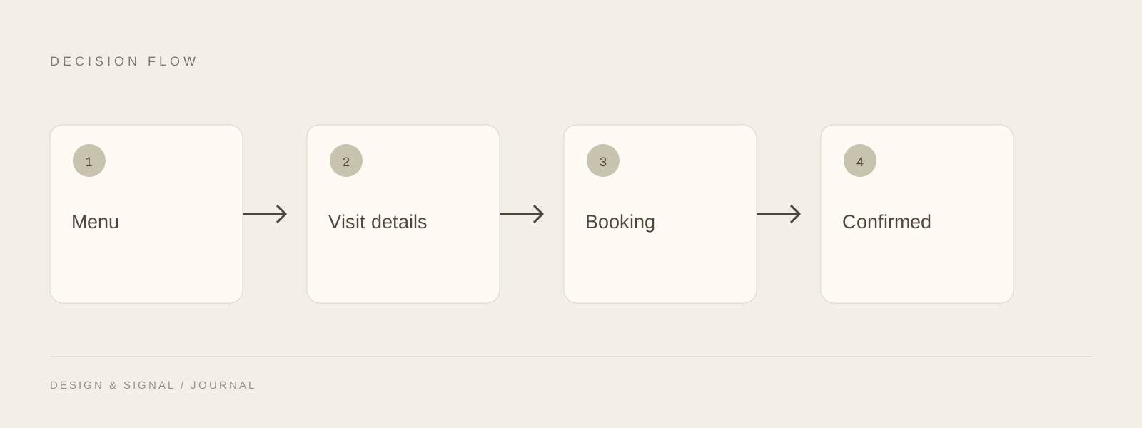
Treat confirmation as a state, not a button click
The riskiest point in many booking journeys is the handoff between the restaurant website and a booking provider. A button can look successful even when the provider rejects the request, the wrong location is selected or the guest never receives confirmation. W3C’s form-notification tutorial is useful here because it distinguishes success, errors and progress as information that needs to be communicated clearly.
Document the states the guest can encounter: selecting a time, leaving for a provider, receiving a confirmed reservation, seeing no availability, or needing to contact the restaurant. If a system only sends a request for later review, say that. Do not label it a confirmed table.
Use the short page and the deep guide for different jobs
This article is a quick design primer: menu, visit information, booking and testing. The longer restaurant mobile booking guide goes further into performance evidence, measurement, accessibility and booking-provider diagnostics. Keeping those jobs separate is better than repeating the same 3,000-word article under two titles.
A restaurant owner should leave this page with a short checklist: can a guest read the menu, understand the visit, reach the correct booking path and recognize whether the reservation is actually confirmed? If any answer is uncertain, fix that before adding another decorative module.