A restaurant website can be visually impressive and still make dinner difficult to arrange. A guest may see beautiful photography but struggle to read the menu, distinguish a reservation request from a confirmed table, or find the entrance. The useful conversion question is therefore not simply whether more people click a button. It is whether the right guests can understand the offer and complete the next step without avoidable uncertainty.
This guide connects design research, a published performance experiment and accessibility guidance to a practical restaurant workflow. It does not claim that evidence from a telecommunications company predicts restaurant sales. Our sample funnels and operating scenarios are explicitly hypothetical. The recommendations are a framework for designing and testing your own journey, not a promised percentage increase.
1. Define the successful visit before designing the homepage
A restaurant may want online reservations, telephone enquiries, direct ordering or private-event leads. These are different tasks. A guest looking for tonight’s availability should not be forced through an event-enquiry form, while someone planning a large party may need a human response rather than an instant table selector. Choose a primary action for each page and make the alternatives understandable.
Write a simple task statement: a first-time guest on a phone should be able to understand the menu, confirm the location and request or complete the appropriate reservation. Add the operating constraints that matter: party-size limits, service periods, booking deadlines and the route for exceptions. The restaurant must approve these facts. A designer should not invent them to make a demonstration look realistic.
Map the journey beyond the website boundary. It may continue into a booking provider, an email inbox or a telephone call. Record who receives the request and what counts as confirmation. If the restaurant cannot see the next stage, that is a measurement boundary to explain, not permission to label every click a booking. This distinction should appear in both the interface and the monthly report.
2. Let design create confidence without hiding the task
Tuch and colleagues’ 2012 research used 119 website screenshots in its first study and found that visual complexity and category familiarity influenced aesthetic judgments after very brief exposure, including 50 milliseconds. This was research on perceived aesthetics, not a restaurant booking experiment. It supports taking first impressions seriously, but not promising more sales from a particular font or animation. Source: original research record.
Our design interpretation is to make the atmosphere distinctive while keeping the route familiar. A guest should recognise Menu, Reserve and Visit without decoding artistic labels. Use photography, typography and spacing to express the experience; use straightforward language to explain the action. The website can feel like a restaurant without making its navigation as mysterious as a tasting menu.
Motion has a role when it adds atmosphere or clarifies a change. It becomes a problem when it delays the menu, moves a target under a finger or makes reading uncomfortable. W3C’s Pause, Stop, Hide guidance requires a control for relevant automatically moving content that continues beyond five seconds alongside other content, subject to its exceptions. Treat that as an accessibility consideration, not merely a preference for minimalist design. Source: W3C guidance.
3. Make the menu a usable decision tool
A PDF can remain useful for printing, but it should not be the only practical way to compare dishes on a phone. Organise the core menu as text with clear category headings, prices and descriptions. Give each dish an understandable name, and avoid placing important qualifiers in an image that becomes unreadable on a small screen. The owner should be able to update a price without replacing an entire graphic.
Decide how to handle multiple menus. Lunch, dinner and private dining may need different structures, but a selector should clearly show which menu is active. Do not silently change menus based on the visitor’s clock if that could hide what they are planning to book. A person researching tomorrow’s dinner at lunchtime still needs the dinner menu. Explicit choice is often a safer design than clever automatic assumptions.
Dietary and ingredient information requires care. Mark only what the restaurant can verify, and explain how guests should ask about specific requirements. A photograph cannot prove that a dish is suitable for an allergy, and a generic icon cannot replace a conversation about preparation. This is a content responsibility, not a gap an AI writing tool should fill. The interface should help the guest communicate, not create false certainty.
4. Make the booking state unambiguous
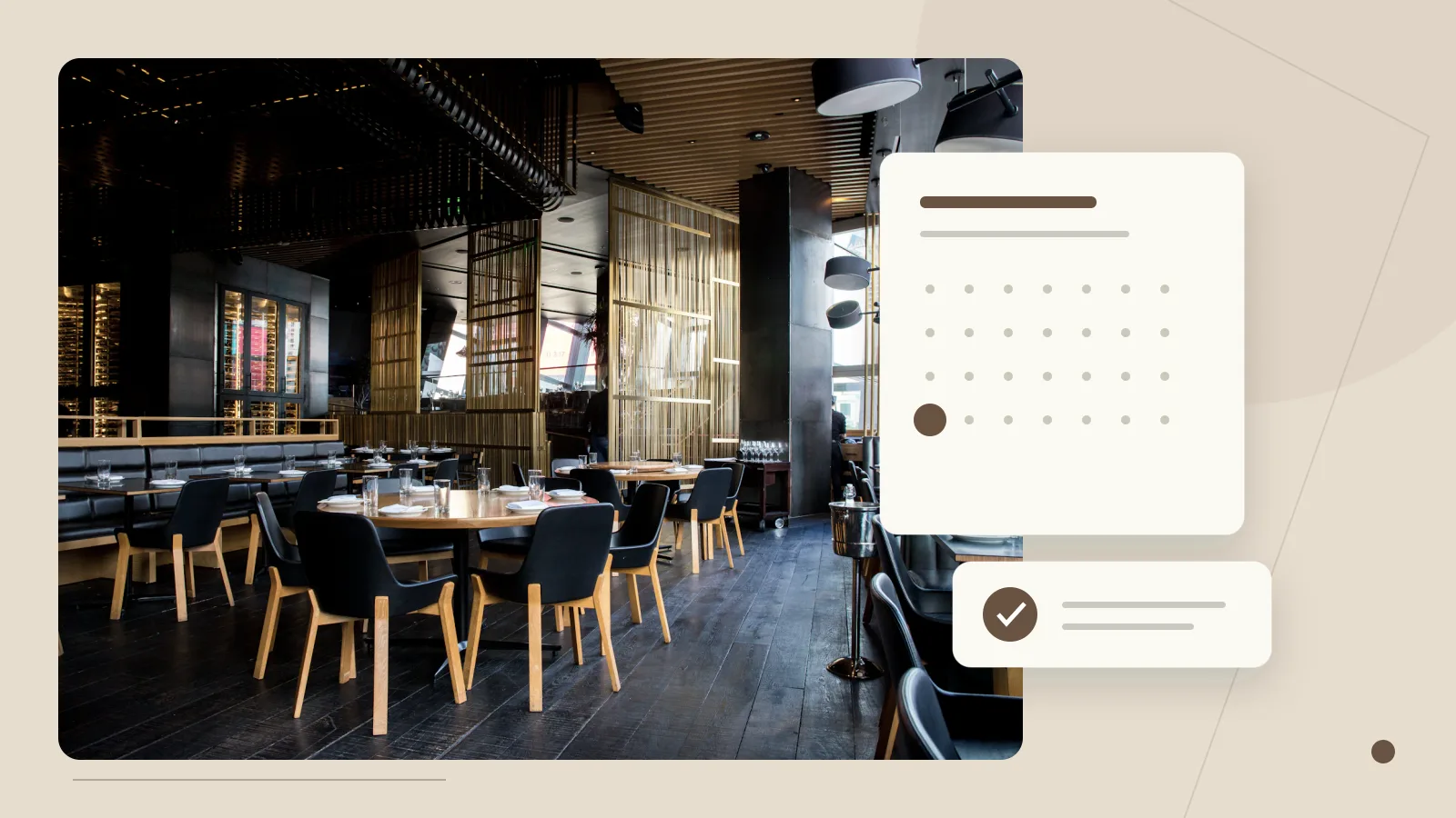
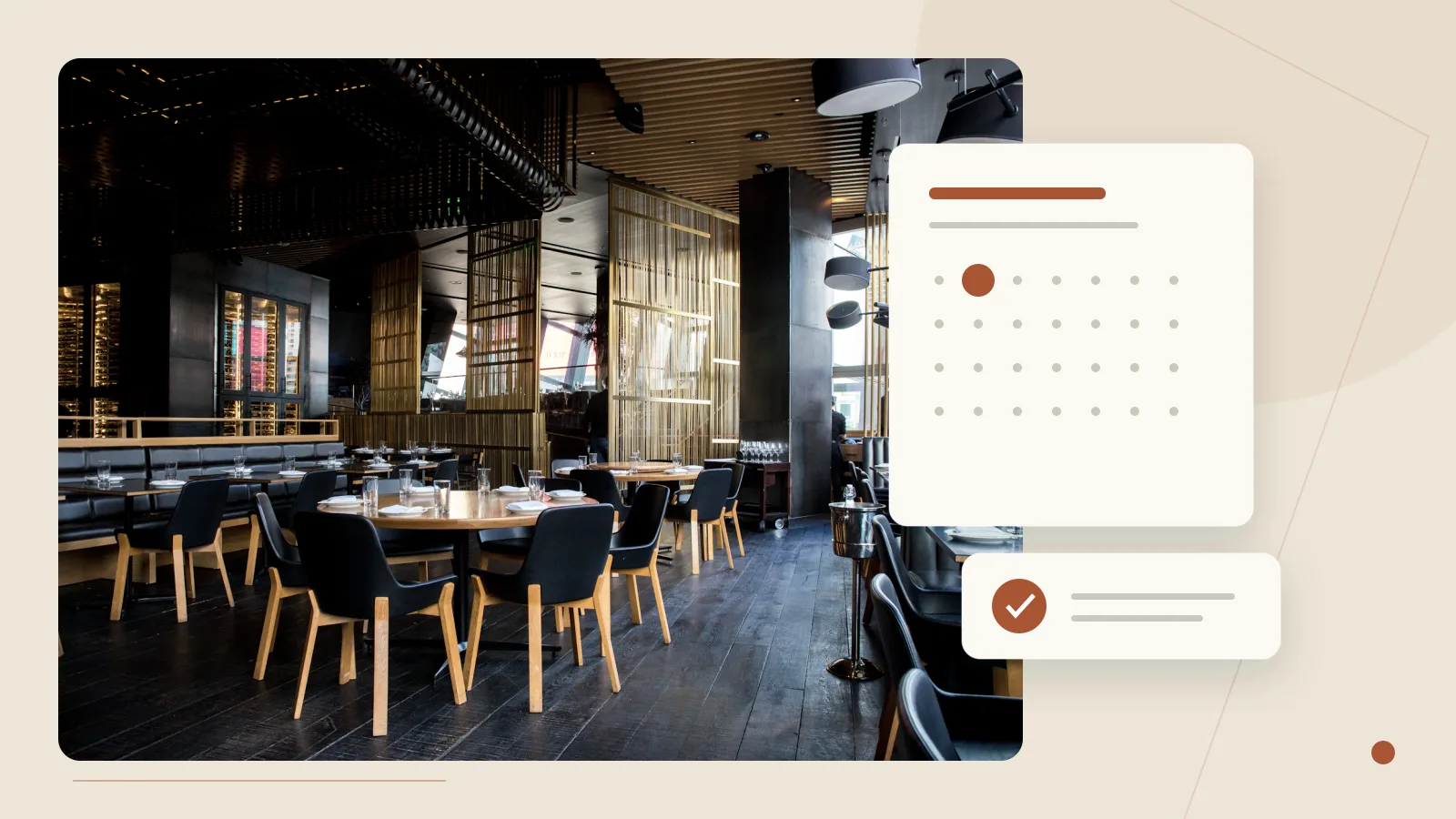
There are at least four distinct states: a guest has started a request, the system has accepted the request, the restaurant has approved it, or a confirmed reservation has been created. Your interface should use the state your actual system supports. A contact form that sends an email usually cannot truthfully display the same message as a booking platform that has reserved inventory.
Our recommended confirmation summary includes the requested date, local time, party size, restaurant location and what happens next. If confirmation is pending, say so. If a booking is confirmed, show the reference and any relevant change instructions supplied by the booking system. A guest should not have to guess whether to arrive. The same distinction applies to a cancellation request versus a completed cancellation.
Design failure states before launch. A network timeout, unavailable slot or rejected submission should not produce a success message. Retain safe form values where possible, explain the next action and avoid inviting repeated clicks that create duplicates. W3C’s form-notification guidance discusses identifying errors and communicating successful completion. We apply that principle to the full booking state, rather than treating a green button as sufficient feedback. Source: W3C form notifications.
The wording should follow the state supported by the restaurant and booking receiver.
- 01Started
The guest entered the booking flow.
- 02Received
The receiver acknowledged the request.
- 03Confirmed
Staff or the booking system confirms the actual table.
- 04Attended
An operating record, not a website click.
5. Read performance evidence without importing somebody else’s result
A 2021 Vodafone case study describes a 50/50 landing-page A/B test with visually and functionally equivalent versions. The optimised version had a 31% improvement in LCP and 8% more sales, with about 34,000 visits per version per day. That is evidence from a high-volume telecom context, not an expected restaurant uplift. It is a useful example of testing performance rather than assuming its commercial effect. Source: web.dev’s Vodafone case study.
The transferable question is what slows your own customer’s decision. It may be an oversized hero photograph, a script that blocks the menu, a reservation widget that loads late or a layout that changes while the guest is tapping. A single overall score can hide these differences. Watch the first visit on a phone and a constrained connection, then investigate the specific resource or interaction causing the delay.
Do not remove every photograph to chase a score. A restaurant still needs to communicate its food and atmosphere. Instead, choose images intentionally, deliver sensible dimensions, reserve their layout space and avoid downloading an entire gallery before the visitor reaches it. Keep essential text and navigation available while optional effects load. The aim is a useful experience under ordinary constraints, not a technically light page that says nothing about the restaurant.
6. Give the technical team measurable targets
The current Core Web Vitals guidance uses LCP of 2.5 seconds or less, INP of 200 milliseconds or less, and CLS of 0.1 or less as good thresholds, assessed at the 75th percentile with mobile and desktop considered separately. These describe loading, interaction and visual stability; they are not booking-rate guarantees. Source: Web Vitals.
Translate those concepts into checks an owner can recognise. Does the important part of the page appear promptly? Does the date selector respond when tapped? Does the Reserve button stay where it was while images finish loading? An owner does not need to diagnose the JavaScript bundle to notice the failure. A developer should connect the visible problem to a repeatable technical test and then verify the improvement.
Field data and a local test answer different questions. A local test helps reproduce a problem under controlled conditions; field measurements describe the users and devices that actually visited. A new or low-traffic website may not have enough public field data for a confident assessment. Record that absence honestly. It is better to maintain a reproducible test and a list of observed failures than to invent a real-user result from one fast office computer.
7. Treat mobile accessibility as part of the booking design
W3C’s WCAG 2.2 target-size criterion sets a minimum of 24 by 24 CSS pixels or sufficient spacing for applicable targets, with exceptions. That is a minimum compliance concept, not an ideal size for every booking button. In a dense calendar or menu selector, we recommend more generous targets where the layout permits. Source: W3C Target Size Minimum.
Also check content at narrow widths and with enlarged text. W3C’s Reflow guidance addresses ordinary content at a width equivalent to 320 CSS pixels without two-dimensional scrolling, apart from content that inherently requires a two-dimensional layout. A wide comparison table may need its own scroll region; the entire page should not drift sideways because of it. Source: W3C Reflow.
In practice, test a long translated dish name, a larger phone font setting, an open software keyboard and a date selector near the bottom of the viewport. Make field labels persistent rather than relying only on placeholder text. Check keyboard focus and the way a dialog returns the visitor to the previous control. These tests often reveal issues that a polished desktop screenshot cannot show.
8. Design the handoff to an external booking provider
An external booking system can be the right choice. The question is whether the handoff preserves the guest’s intention. Check that the link opens the correct location, retains the selected service when supported, uses the expected language and presents prices or deposits consistently. Avoid building a custom reservation system merely to keep everything visually inside your own website.
There is also a measurement boundary. Google’s cross-domain measurement documentation describes the additional setup required to preserve measurement across domains. It does not mean an owner can measure a booking provider they do not control. Confirm the provider’s supported integration and permissions before claiming end-to-end attribution. Source: Google cross-domain measurement.
When completed-booking data is unavailable, label the event as a booking-link click or handoff. Ask the provider or the restaurant whether a legitimate export can connect it to confirmed reservations at an appropriate aggregate level. Do not send names, telephone numbers or dietary details into analytics events. The absence of perfect attribution should lead to clearer reporting, not more intrusive collection.
9. Use a funnel that reflects the restaurant’s operation
Consider this entirely fictional monthly funnel: 2,000 relevant website sessions, 500 menu views, 160 booking starts, 100 confirmed reservations and 82 parties that attend. A menu view is not a reservation, and a reservation is not an attended visit. The figures illustrate why a website report should not collapse the entire journey into one conversion number. The restaurant’s booking and attendance records need their own definitions and privacy safeguards.
| Stage | What the event means | What it does not prove |
|---|---|---|
| Menu view | The menu page or section was opened | The guest read every dish |
| Booking start | The reservation flow was entered | Availability matched the guest’s needs |
| Request received | The receiver accepted the request | The restaurant confirmed a table |
| Reservation confirmed | The booking system or staff confirmed it | The party attended |
| Attended visit | The operating record shows attendance | The website alone caused the visit |
In this example, the confirmation rate is 62.5% of booking starts, while attendance is 82% of confirmed reservations. Those denominators matter. If a redesign raises booking starts but not confirmations, inspect availability, deposit explanations and the external handoff. If confirmations are stable but attendance changes, the problem may involve reminders, cancellation policy or circumstances outside the website. These are diagnostic possibilities, not conclusions from the fictional numbers.
Use the observable website events without relabeling them as business outcomes.
- Menu or service page opened
- Booking-link click or flow start
- A successful receiver acknowledgement
- Table actually confirmed
- Party attended or cancelled
- Relevant booking and attendance records
10. Plan an experiment that does not confuse traffic with design
A useful experiment changes a clearly defined part of the journey and measures an agreed outcome. For example, compare two presentations of service periods while keeping the underlying availability unchanged. Decide the primary measure before seeing results, and note secondary measures such as abandonment or unsuitable enquiries. Do not declare success simply because whichever metric improved happens to look impressive.
Low-volume restaurants may not have enough traffic to separate a small effect from ordinary variation. Running a short A/B test on a handful of bookings can create false confidence. Start by finding obvious failures through observed tasks: ask someone unfamiliar with the website to locate the menu and request the right table, then watch without coaching. This is a usability exercise, not a statistically representative survey. Its value is identifying concrete obstacles you can reproduce.
Compare business periods thoughtfully. A rainy weekday and a holiday weekend are not interchangeable. Record changes to opening hours, menu pricing, promotions and available tables. A before-and-after comparison can still be useful for operations, but its limitations should remain visible. A report should be allowed to say the sample is not yet conclusive. That is more trustworthy than turning every movement in the graph into a design victory.
11. Build trust with specific, current information
Trust often begins with practical certainty. Show the actual venue, current menu and a clear route to contact the team. Explain when a price applies and whether a private-event enquiry is handled differently from a normal reservation. A guest arranging an important occasion needs to know what is confirmed and what must still be discussed. Vague enthusiasm is not a substitute for those details.
Use authorised real photography for claims about the restaurant. Illustrative images can help communicate a design concept, but should not be presented as the customer’s actual dining room or dishes. Likewise, an award, review or press mention belongs on the site only when the source and context can be verified. An attractive trust strip with invented logos is worse than a modest explanation of how the restaurant operates.
Write the visit information as part of the experience. Ask the owner to confirm entrance details, parking guidance, accessibility information and the relevant contact route for questions. Do not guess from a map or a photograph. If a fact is uncertain, provide an honest way to ask rather than a confident but potentially misleading icon. The interface should reduce the cost of planning a visit, not conceal unknowns.
12. Keep menu changes and translations under control
Give each menu item a stable identity and keep prices separate from decorative layout. This makes it easier to update the same dish across the website, a printable menu and the language versions. It also helps prevent a designer from accidentally editing an old duplicate. The exact system can be simple, but the restaurant needs to know where the approved version lives and who can change it.
For bilingual menus, review the commercial meaning as well as the grammar. Dish names, serving sizes, inclusions and qualifiers must agree. A translated starting price should not become a fixed-price promise. Keep a small change log showing which pages and languages were checked. When a change affects a live booking rule, update that rule before promoting the new content.
AI can assist with draft wording and consistency checks, but the restaurant remains responsible for ingredients, dietary information and operational promises. An automated publishing process should preserve that approval boundary. A new draft should not overwrite the version customers currently use until it has been reviewed and successfully built. Good maintenance is part of conversion design because an elegant interface with wrong information creates the wrong expectations.
13. Separate the essential website from optional features
A strong first release does not need custom loyalty accounts, a bespoke reservation engine and a complex animation on every page. Start with a readable menu, clear venue information, a dependable booking path and a way to update them. Add features when they solve a repeated problem and someone is available to maintain them. A feature that nobody owns can become a future source of friction.
For example, a private-dining form may justify a separate page if staff repeatedly need the same event details. A gallery may be valuable when it helps guests understand the space. A 3D scene may communicate an unusual brand experience, but should remain optional to the core task. Decide the reason for each feature before deciding the technology. This protects both performance and the restaurant’s time.
A useful fallback plan is deliberately simple. Suppose the external reservation provider is unavailable during a busy evening. The website should not keep inviting guests into a broken flow without explanation. Agree who can update the notice, which telephone or enquiry route the restaurant can realistically staff, and when the notice should be removed. Do not advertise immediate telephone confirmation if nobody is assigned to answer. Test the fallback with the same care as the normal path, including the Chinese version where provided. This operational preparation may matter more than adding another visual feature because it gives staff and guests a clear response when the ideal journey is unavailable.
14. A practical acceptance test before launch
Ask a person unfamiliar with the website to complete three tasks on a phone: find a dish and its price, identify the correct location and arrange the intended visit. Then repeat the booking path with unavailable information, a validation error and a slow connection. Check that the restaurant receives the expected record and that the guest sees the correct status. Use synthetic details when testing and remove the test records afterwards.
Repeat the essential tasks in each published language. Check that a sticky button does not cover content, that a dialog can be closed and that a failed request does not erase everything. Record the device, browser, test date and observed outcome. Automated checks help, but they do not replace a person following the journey with the same uncertainty as a new guest.
The goal is not to make every restaurant website look alike. It is to make the business’s character compatible with a clear path to action. Explore our restaurant design demonstration for a labelled example, and read the shorter mobile-menu guide for the starting structure. The useful next step is to audit one real journey from first visit to confirmed receipt, then fix the point where confidence or completion is lost.