A site can feel expressive without making every object move. Our starting question is not which animation library to install. It is what the motion contributes: a sense of material, an explanation of a process, a change of emphasis or a useful response to an action. If that contribution is unclear, removing the animation may improve the design.
Think in layers rather than effects
Separate the information layer from the atmospheric layer. Headings, prices, navigation and enquiry controls must work as ordinary page content. Decorative movement can sit behind or around them, but the visitor should never need to operate a canvas to understand the service. This distinction also gives the design a clear fallback when advanced graphics are unavailable.
A continuous background can feel more cohesive than a collection of unrelated animated cards. It does not require everything to remain transparent. Quiet, solid reading surfaces can appear where content becomes dense, while the surrounding texture carries the visual language between sections. The contrast between stillness and movement is itself a design decision.
Keep scrolling and reading predictable
Our preference is to preserve native scrolling. A person should be able to skim, move back to a price or use keyboard navigation without learning a special gesture. Motion may respond to scroll position, but should not prevent normal navigation or force a long sequence before useful information becomes available.
W3C’s explanation of WCAG 2.2.2 describes controls for non-essential automatically moving content that lasts more than five seconds alongside other content. That is one reason we provide a clear pause control. Respecting reduced-motion preferences is another layer of consideration, not a substitute for reviewing the whole experience. An automated scan alone cannot certify that every animation is comfortable.
Design the phone version deliberately
A smaller viewport is not a miniature desktop. The space needed for text, controls and images is different, and visitors may prefer to save data or avoid heavier graphics. We begin with a designed still composition and keep an optional, lighter interactive experience separate. The main service and enquiry routes remain available without it.
Review actual controls at a narrow width. Confirm that language and currency choices remain visible, the keyboard does not obscure required fields and large display type wraps intentionally. Do not judge the result only from a scaled screenshot of the desktop layout. Test orientation changes and inspect the same content with larger text.
Judge the outcome, not the technology label
A technically impressive scene can still confuse a visitor. A useful review asks what people remember about the business, whether they can identify the next action and whether they can pause the experience. Record observed behavior separately from assumptions about revenue or conversion.
Our interactive studies illustrate different business journeys, while the playground exposes a more technical design experiment. Keeping these roles distinct lets the main website express a point of view without requiring every visitor to explore the technology. The purpose is a better first impression with a clear next step, not motion for its own sake.
Put first-impression research in context
A well-known 2012 study by Tuch and colleagues, published in the International Journal of Human-Computer Studies and surfaced by Google Research, tested first impressions of 119 website screenshots. Across very short exposure times, visual complexity and prototypicality affected aesthetic judgments; lower visual complexity and more familiar category cues tended to be rated more favorably. That is useful design evidence, but it is not a conversion experiment and it does not say that every distinctive site should look conventional.
For a small-business studio, the lesson is subtler: build one memorable visual idea, then make the rest of the interface legible enough that a visitor still understands what kind of site this is. A dramatic material background can work because navigation, text hierarchy, pricing and contact behavior remain familiar.
Give the experience a motion budget
List the moving elements before building them. Which one establishes atmosphere? Which one explains a relationship? Which one responds to deliberate input? If several elements perform the same job, remove some. Motion becomes more convincing when stillness has a role.
For long pages, decide what stops when it is off screen. A full-screen Three.js background does not need to render at full effort while the visitor is reading a dense article three viewports below. Pausing hidden work helps performance and reduces needless battery use. The specific frame rate is an engineering decision to measure on the target devices, not a universal number to promise in an article.
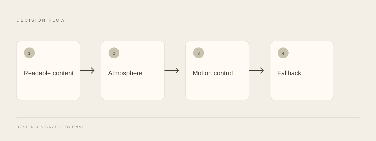
Keep information readable before, during and after the advanced layer.
- 01Start with content
A designed still is already useful.
- 02Run with purpose
Use motion for atmosphere or clear feedback.
- 03Pause when needed
Respect visitor controls and hidden work.
- 04Retain a fallback
Failure must not erase the service message.
Treat control and fallback as part of the visual system
W3C’s Pause, Stop, Hide guidance exists because continuous movement can interfere with reading and attention. A pause control should look like part of the site rather than an emergency switch added after the design is finished. Reduced-motion preferences, save-data conditions and WebGL failure need equally deliberate states.
A fallback should preserve the composition rather than collapse to a blank rectangle. The static poster, color treatment and headline hierarchy can carry the same art direction even when the renderer is unavailable. That makes the advanced layer optional in a technical sense without making the design feel optional.
Review motion with business tasks
Do not end the critique with “the animation feels smooth.” Give a reviewer a task: understand the service, compare a price, find a case study, change language, submit an enquiry. Then observe whether motion helps orientation or competes with it.
Our design playground keeps the more technical interaction in a separate space, while the main site uses atmosphere more quietly. That split is intentional. A studio can demonstrate programming ability without forcing every prospect to operate a 3D scene before they learn what the business sells.